Sunday, August 21, 2011
Wednesday, August 17, 2011
The Art of Short Story: Part VI...the end?
"At the Stroke of Midnight" by Steranko
I "discovered" Steranko just a few years ago, but "WOW" was a wonderful "discovery". I don't know much about him and I can't say I like some of the early works that look more like Kirby than anything else, but his work on just a few issues of Captain America and this short story (as well as "Red Tide") are nothing short of magical. He used everything from composition to lettering and color to tell his stories and he did it in such a sophisticated manner!
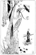
"Temple of the Spider" By Archie Goodwin and Walter Simonson
This just squeaked in just under 12 pages. One of my first great comic book impressions came from reading the Manhunter series that Goodwin and Simonson worked on together. It was one of the few things that DC collected and reprinted back then and that made it very assessable. Wonderful stuff (that got a couple of Eisner Awards for Goodwin and Simonson), but this story (that never got even mentioned for an Eisner) might be better than Manhunter serial. The art is definitely more mature here and Simonson's storytelling is very solid...and of course Goodwin is the master of writing short stories (as he proved during his Creepy and Eerie days).
"Elektra" by Frank Miller (Bizarre Adventures Magazine)
I think that was the first time that I did not just look at the drawings in the panels, but also looked at how the panels were arranged on the page...storyteling, wow! Frank Miller told great stories in Daredevil every month, but this short story was something totally remarkable AND it was a perfect black and white story. I re-read this story before posting about it and I was glad to see that it does not feel dated, unlike some of the earlier Daredevil work. I think it has been colorized and reprinted in a number of collections, but if you have never seen it printed magazine size and you never seen it in black and white, you are missing out.
The images below are from the original pages posted on comicartfans.com...pretty :)
Friday, August 12, 2011
Tuesday, August 09, 2011
Art of Short Story: Part IV
"The Muck Monster" by Bernie Wrightson from Eerie
I am not even sure what I can say about this story...other than the fact that if I would total all the time I have spent reading/looking/copying each page it would probably be days.
"The Vanities of Philip Whitehead" by Sandy Plunkett (inked by Scott Hampton)
Another story that impacted my understanding of comics. This is a straight up heroic story and is an artistic tour de force from a classically inclined artist. Wonderful storytelling and rendering throughout.
I have been fortunate to be able to contact Sandy Plunkett and ask him about the story. He was kind enough to jog down a few notes about it and provided a scan of one of the pages as it looked before it got colored:
"Mark Gruenwald gave me this job, though by the time I was half way through the story, the title (Solo Avengers) had fallen into the hands of Greg Wright. Both were great editors to work for- i.e.; they both let me do whatever I wanted. Though I wish one of them had caught the fact that the feminine spelling of Renee has two "e"s.
Anyway. I never got much response from anyone about this story so it's gratifying that Alex has chosen it for this blog. It is a favorite of mine, mostly because I think it manages to tell a fairly satisfying story in very few pages (11). Not easy. To me, it's a study in compressed storytelling. I once heard a movie director (Steven Soderbergh, I think) say that, in his opinion, film making was all about segues, going from one scene to another. I think this is true of all forms of storytelling. The skill with which you make those segues can mean the difference between a bumpy, distracting journey and magic. And a lot can happen in those segues. And if you're writing a story of very limited length, it seems that you have to make full use of that fact. On this page (I consider it my "Gilligan's Island" page- I'd be happy drawing nothing but Gilligan's Island pages for the rest of my life) the top panel on the beach has followed a plane crash-landing in a lagoon. A lot has happens in that interval- the passengers set up camp, got a radio working, etc. We don't see this being done- we drop back into the story at a point when all the activity is completed. A big time saver. But the important jump is to the next panel where we learn that T'challa (ex sp) had separated himself from the group for mysterious reasons. Again, we learn of this after the action has occurred. And by immediately shifting the focus on this aspect of the plot,we bypass a lot of less consequential action that would have been shown in a longer story. The reader is pointed back to the real star of the story (T'challa's friend Philip Whitehead) and the psychoactive plant upon which the plot is hinged. Hopefully, the reader notices none of this machinery.
Sandy"
Subscribe to:
Posts (Atom)