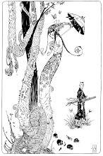
I am trying something different for some of the backgrounds in the series. Since my figures are inked pretty tight, I decided to loosen up on the backgrounds that are not establishing shots and hopefully create a nice contrast in the artwork...sometimes it works...sometimes it does not.


3 comments:
i like it, it makes the linework stand out without cluttering the page , creating a nice depth of field...
Alex,
I think they're really excellent. Not just the wash backgrounds, but the foreground drawings and compositions. Very nice!
keep..doing...this.
it works so well. over-rendering BGs can clutter and flatten a drawing. this looks very dynamic, and much more organic. a nice blend of very clean and concise line art with the abstracted, washed-out BGs. nice, nice, nice.
Post a Comment