Friday, December 30, 2011
Shadow in black and white...and color
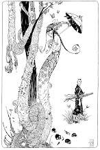
Over at inkdestroyedmybrush.blogspot.com, Charles has been posting some wicked Shadow drawings...in color! I don't color very often, but Charles' work got me inspired to try. So here we go.....
Wednesday, December 28, 2011
Monday, December 19, 2011
Monday, December 12, 2011
Friday, December 09, 2011
Tuesday, December 06, 2011
More Dark Crystal inking
Rick Leonardi rare pages
I happened upon an interview with Josef Rubinstein who mentioned that he inked a few pages penciled by Rick Leonardi for a book called "Unforgiven" published by the American Bible Society in 1996. Mr. Rubenstein had a number of the pages posted in his Comic Art Fans account and I wanted to share a few of them here:
Sunday, December 04, 2011
Wednesday, November 30, 2011
Inking with brushes ... or "what the...!?!?!?"
I have been drawing with India ink for a number of years. I started inking with ball point pens, but quickly transferred to dip pens (crow quills). When I started showing my drawings around the local comic shop, I started hearing about how all the comic book artists use brushes to ink their pages. AHA! That made sense because in order for me to get the same thick-thin lines that I kept seeing in comic books I had to go over all of my lines a few times with a pen.
What followed was an odyssey of trying different brushes to figure out how to use one. All of this was before the internet, so all of my experiments were based on what I heard at comic book conventions or read in Amazing Heroes (remember that magazine?). I will just say that after a few tries I got frustrated because I just was not able to duplicate the types of smooth lines that I saw in my mind's eye.
Then I met James Keefer and he invited me to hang out and watch him draw and ink. He took the time to show me how he used his brushes and I got to actually see him apply ink on paper. It was an eye opener! Back than, most of the time he inked thin-to-thick and thus was able to exercise a lot of control over the line and that was exactly what I wanted to do.
I bought another brush (Windsor Newton #4) and tried it again. It was better. I remember getting Mike Zeck Punisher portfolio and over laying tracing paper over the plates and trying to duplicate the lines. I could pretty much trace most of it, but I was still having issues when it came to curving lines, but I figured that was just a question of practice.
Norman Felchle and I spent a lot of time practicing and talking about we discovered during our exercises. Norman quickly surpassed me and could ink circles around me, but I did not give up....like I said, I thought it was all a matter of practice. But, I also had a problem with the W&N brushes. If I remember correctly, the brush was $20-24 and I had to buy 2 of them before I got one that held a nice sharp point and had a good "spring" to it for inking (the brushes were fine for water color, but inking required a certain quality control). It seemed very expensive.
So I started looking for an alternative. It was almost impossible to find a water color rounded brush of the same size as W&N #4 that held a nice point to make fine lines (and cost less than $20), so I kept buying smaller and smaller brushes until I arrived at a $6 brush, size 00. It did not need to hold a point...it was just a few bristles and if I needed a thicker line, I would twist the brush in my hand as I was drawing to draw with the side of it to go thicker. Did not matter who made them the price and quality was about the same. For me it was a sort of universal approach. It did not matter where I was, I could buy something like that at any art supply or craft craft store. The only problem, it does not hold a lot of ink, so I am constantly dipping it. But I figure that is why they call art a "struggle".
Over the years my inking methods have evolved in include a variety of tools (dip pens, mechanical pens, markers, sponges, cloth...computers), but the brushes always staid the same, 00 and $6 (actually the price went down to $4). Until yesterday....
Charles Yoakum started blogging again recently (after taking a break from writing for a while) and he mentioned a new brush he has been reading about. Now, one thing to keep in mind, Charles is a great artist and a fantastic inker, I like to listen to him talk about the art of inking. So I followed the links and bought Escoda #4 brush for $13.40.
Yesterday I tried it and it was like an electric shock. Wow, is that what it supposed to be like? Above is a page from the Dark Crystal book that I inked with the new brush. It was quick, smooth, and easy. The page is drawn on 8.5 by 11, so it's a 1-to-1 without any reduction from original to reproduction...I can only imagine how cool it would be to work a size bigger!
I recommend the brush to anyone who is interested in inking with brushes. Thanks Charles!
I also wanted to mention that I was lucky enough to watch Mick Gray work on a number of books over the years, and I am simply amazed at what Mick can do. Thick-to-thin, thin-to-thick, slow line, flicking, feathering, spacing of lines, line thicknesses...it is inspiring and I keep telling myself: "I just need to practice more."
Sunday, November 27, 2011
Dark Crystal illustration - Aughra
Saturday, November 26, 2011
Tuesday, November 22, 2011
The "Holy Grails" of books.....
I was thinking the other day about all of the neat books that have been coming out recently (like the Artist's Editions from IDW and the Warren reprints from Dark Horse) and I started remembering what it was like trying to track down certain books before the internet made it possible to get anything you want...I also realized that a lot of the "Holy Grail" books that I imagined would be fantastic, just sort of turned out OK.
Case in point. On one of my first trips to San Diego Comic Convention I met Alex Nino. He was promoting a book called "Space Pirates" (that never got published) and I was shocked that he was not surrounded by hundreds of people asking for his autograph. I loved his art and I just assumed I would not be able to get any face time with him. As it turned out, I got a chance to hang out with him for maybe 10-15 minutes and ask him a few questions about some of my favorite stories that he illustrated. While we were talking, he mentioned that he illustrated a book about the history of South America for a publisher in Spain. The print run was so low, that even he did not get a copy. I asked him to write down the title, so I can try to track it down someday. He wrote the title on the flier for Space Pirates and signed it in the bargain. "Americo Vespucio".
Years went by and first Bookfinders.com and then Amazon.com matured on the net. Then Ebay started growing and going internationally. I always checked for a few titles when I had a few minutes and finally after years of looking I found a copy on Spain's equivalent of E-bay. I had to pay for it through Western Union and with the tax and postage the total bill was a bit over $55...ouch.
The book arrived. Hardbound. Over sized. 50 pages of Alex Nino penciling, inking, and coloring his own work with markers. Cool subject matter. Printed 1992. And that is sort of the tricky part. By 1992, Alex Nino moved away from his "tight" rendering style into a more loose approach, mostly inking with ballpoint pens or markers instead of brushes and dip pens, as a result a very uniform line throughout the drawings. And as good as that is, that is not my favorite style of Alex Nino. It's a cool book to have, but it is not as grand as I imagined it being for almost 7-8 years.
You would think I learned my lesson. Nay. I can list a number of "prizes" that I pursued for years across the internet only to be let down a bit when I finally got them.....
Black and white French edition of Steranko's "Red Tide". Check.
Collected edition of Steranko's adaptation of "Outland" (also in French). Check.
William Stout's Conan storyboards reprinted in Metal Hurlant. Check.
John Byrne's "Fear Book". Check.
Al Willaimson's "Empire Strikes Back" printed in Britain in black and white. Check.
And still I search and search and search.....
Tuesday, October 25, 2011
Sketches in the evening...with Monster Blood Tattoo
Tuesday, September 27, 2011
Dark Crystal pages preview
Archaia has posted a preview of the colored pages from the Dark Crystal book.
It can be viewed here: Dark Crystal Preview
Wednesday, September 21, 2011
Sunday, August 21, 2011
Wednesday, August 17, 2011
The Art of Short Story: Part VI...the end?
"At the Stroke of Midnight" by Steranko
I "discovered" Steranko just a few years ago, but "WOW" was a wonderful "discovery". I don't know much about him and I can't say I like some of the early works that look more like Kirby than anything else, but his work on just a few issues of Captain America and this short story (as well as "Red Tide") are nothing short of magical. He used everything from composition to lettering and color to tell his stories and he did it in such a sophisticated manner!
"Temple of the Spider" By Archie Goodwin and Walter Simonson
This just squeaked in just under 12 pages. One of my first great comic book impressions came from reading the Manhunter series that Goodwin and Simonson worked on together. It was one of the few things that DC collected and reprinted back then and that made it very assessable. Wonderful stuff (that got a couple of Eisner Awards for Goodwin and Simonson), but this story (that never got even mentioned for an Eisner) might be better than Manhunter serial. The art is definitely more mature here and Simonson's storytelling is very solid...and of course Goodwin is the master of writing short stories (as he proved during his Creepy and Eerie days).
"Elektra" by Frank Miller (Bizarre Adventures Magazine)
I think that was the first time that I did not just look at the drawings in the panels, but also looked at how the panels were arranged on the page...storyteling, wow! Frank Miller told great stories in Daredevil every month, but this short story was something totally remarkable AND it was a perfect black and white story. I re-read this story before posting about it and I was glad to see that it does not feel dated, unlike some of the earlier Daredevil work. I think it has been colorized and reprinted in a number of collections, but if you have never seen it printed magazine size and you never seen it in black and white, you are missing out.
The images below are from the original pages posted on comicartfans.com...pretty :)
Friday, August 12, 2011
Tuesday, August 09, 2011
Art of Short Story: Part IV
"The Muck Monster" by Bernie Wrightson from Eerie
I am not even sure what I can say about this story...other than the fact that if I would total all the time I have spent reading/looking/copying each page it would probably be days.
"The Vanities of Philip Whitehead" by Sandy Plunkett (inked by Scott Hampton)
Another story that impacted my understanding of comics. This is a straight up heroic story and is an artistic tour de force from a classically inclined artist. Wonderful storytelling and rendering throughout.
I have been fortunate to be able to contact Sandy Plunkett and ask him about the story. He was kind enough to jog down a few notes about it and provided a scan of one of the pages as it looked before it got colored:
"Mark Gruenwald gave me this job, though by the time I was half way through the story, the title (Solo Avengers) had fallen into the hands of Greg Wright. Both were great editors to work for- i.e.; they both let me do whatever I wanted. Though I wish one of them had caught the fact that the feminine spelling of Renee has two "e"s.
Anyway. I never got much response from anyone about this story so it's gratifying that Alex has chosen it for this blog. It is a favorite of mine, mostly because I think it manages to tell a fairly satisfying story in very few pages (11). Not easy. To me, it's a study in compressed storytelling. I once heard a movie director (Steven Soderbergh, I think) say that, in his opinion, film making was all about segues, going from one scene to another. I think this is true of all forms of storytelling. The skill with which you make those segues can mean the difference between a bumpy, distracting journey and magic. And a lot can happen in those segues. And if you're writing a story of very limited length, it seems that you have to make full use of that fact. On this page (I consider it my "Gilligan's Island" page- I'd be happy drawing nothing but Gilligan's Island pages for the rest of my life) the top panel on the beach has followed a plane crash-landing in a lagoon. A lot has happens in that interval- the passengers set up camp, got a radio working, etc. We don't see this being done- we drop back into the story at a point when all the activity is completed. A big time saver. But the important jump is to the next panel where we learn that T'challa (ex sp) had separated himself from the group for mysterious reasons. Again, we learn of this after the action has occurred. And by immediately shifting the focus on this aspect of the plot,we bypass a lot of less consequential action that would have been shown in a longer story. The reader is pointed back to the real star of the story (T'challa's friend Philip Whitehead) and the psychoactive plant upon which the plot is hinged. Hopefully, the reader notices none of this machinery.
Sandy"
Thursday, July 28, 2011
Eisners...how does it work for anthologies?
I have just learned that "Mouse Guard: Legends of the Guard" anthology won a 2011 Eisner. Which is pretty cool, because I contributed (snuck) a story to it... so does that mean I can now put "Eisner Award Winner*" next to my credits?
*2011 Eisner Award for Best Anthology "Mouse Guard: Legends of the Guard"
Saturday, July 30th at Hijinx
I will be hanging out at Hijinx on Saturday. There will be tons of 50 cent comics and cool guests celebrating the sale. I am going to bring my dark crystal pages and whatever else I can find :)
Tuesday, July 26, 2011
Thursday, July 21, 2011
The Art of Short Story: Part II
"Maintaining Appearances" by Ron Marz and Rodolfo Damaggio from Batman Chronicles
Damaggio only worked in comics for a few years before moving on to work as a storyboard artist and hardly anyone remembers him, but the guy was an awesome storyteller. He drew about a year worth of Green Arrow monthlies and did a 4 issue "Batman vs Predator III" miniseries that are just wonderful to read. He also did a few short stories about the DC Universe. His artwork is somewhere in between Alex Toth's "simplification" and Al Williamson's "photo realism" and works best when he is inking himself (in this story he is penciling, inking, and coloring). This one is about the duality of Bruce Wayne and Batman. Clever and well told with a gentle twist at the end.
"Like Riding a Bike" by Devin Grayson and Rodolfo Damaggio from Batman 80-page Special
Another Damaggio gem. A story about Wonder Girl talking to Nightwing as they go for a coffee in their civilian identities. This is an excellent story with wonderful characterization, action, humor...AND wonderful Damaggio storytelling (again he pencils, inks, and colors).
"The Couch" Vito Delsante and Dan Haspiel from Batman Adventures
Continuing with the Batman theme, here is a story that I think might be one of the best stories that plays with the Batman myth. In a way, like "Maintaining Appearances" this only works because of decades of established Batman continuity, but it is so clever and uses the comic book medium so well... it shows the pathos and the humor all at the same time which is one of the most unique features of comics.
Monday, July 18, 2011
The Art of Short Story: Part I
A whole discussion can be had about how the policies of reprinting individual issues in TPB collections have changed how the stories are structured in each 22-24 page book. Thinking about that I started remembering certain short stories that I love, but I believe would not find a place in the current publishing environment...they just would not fit into any particular TPB.
Lets see how many of these sound familiar and I would love to hear your favorites (as long as they are 12 pages or less). By the way, I am not listing them in any sort of order of significance, they are all lovely in their own ways AND I feel that each one uses the comic medium to a perfection. So here I go:
"Beguiling" by Barry Windsor-Smith from Epic Illustrated
When I saw this, a bomb went off in my head. At that time I have heard about Barry Smith and the guy who worked at the comic shop seemed excited about Barry Smith's "return to comics", but I did not expect this. Reading this story is like having a vivid dream...and the art is fantastic.
"---Zounds O' Silence" by Larry Hama and Michael Golden from Marvel's Holiday Special
Unlike "Beguiling", this story was published without any fanfare. Just a short story in a silly holiday special that was PENCILED and INKED and COLORED by MICHAEL GOLDEN. Totally "silent" (except for the sound effects) it is an artistic feast with a cute ending to it.
Saturday, July 16, 2011
Dark Crystal Sketches: Aughra
Wednesday, July 06, 2011
Doctor Strange: The Oath
I just finished reading "Doctor Strange: The Oath" by Brian Vaughan and Marcos Martin. This is the collection of their 5 issue mini series from 2007 and I can't believe I did not give it a try earlier. The story has a number of subplots, one of them being: "What if Doctor Strange could cure cancer through magic?". I found that particular thought fascinating, and I really enjoyed how the story did not take any easy "outs". It asked tough questions and gave answers that were believable and sounded true to the characters.
Wonderful interactions between everyone involved in the story were highlighted by very expressionistic art of Marcos Martin. He sort of has a cool style that is a cross between Steve Ditko and Paul Pope...and it really works great here!
To sum it up, this was the best Doctor Strange story I ever read.
In the mean time still working on "Dark Crystal". Got the script and the layouts done up to page 48...17 more pages and it's off to the printers.
Wednesday, June 29, 2011
Thursday, June 23, 2011
Death of Captain Marvel
I am a big Jim Starlin fan and I read a lot of his work, but I never read THE graphic novel. I am not sure why...I do remember when it came out, or at least hearing about it coming out. It sold out pretty quick and a friend of mine (who was even a bigger Jim Starlin fan) got his sister's boy friend to drive him around San Jose until he found a copy. I remember being taken back when he told me that he bought a copy for himself but did not pick me up a copy...in any case I never got to spend my $6 to buy a copy.
Back than, comics did not get reprinted (unless a Conan story published in Savage Sword of Conan got colored and printed as a fill in the Conan The Barbarian comic), so I thought I pretty much missed my chance of getting it. But things were changing. The first Marvel graphic novel got a second (and a third and a fourth) printing pretty quickly but I never got around to buy them. Mostly because I started hearing that The Death of Captain Marvel was “not as good” as “his Warlock and Captain Marvel stuff”. Later I heard the same opinions about Jim Starlin’s “Dreadstar” and “Breed”. Just recently I hear that same opinion about “Death of the New Gods”…but I enjoyed all of those above mentioned books, so last week while shopping at Hijinx I took the plunge and got a copy of the reprint that was available in their stock.
This is a reprint of Captain Marvel 34, Marvel Spotlight 1 &2, and “The Death of Captain Marvel” graphic novel. The reprint is comic sized, so the pages have been shank down from the original magazine sized book and the reproduction is horrible. It looks like someone has scanned the printed pages of the graphic novel and there are all sorts of problems with zip-a-tone and color dropping out in certain spots. It’s a shame.
I read it.
I loved it.
The writing was wonderful, the storytelling was great, art was mature and well thought out. It was a great story. A true graphic novel.
Saturday, June 18, 2011
This is Old School, baby!
I was reading the blog post by Alex Alice, the French writer/artist of comics. In the latest post he talks about doing the colors on his latest volume...and he is still doing it by hand! He feels that there is certain richness that goes missing if the same process is done digitally. Don't hear that sort of a thing too often, so it's kind of cool, check it out at: Alex Alice
Thursday, June 16, 2011
Dark Crystal page 3...I guess it's OK to post
The colored version was posted by Stephen Christy on his twitter account, so I figure I can post the original.
I have been working on the first Dark Crystal graphic novel (of three that are planned) since mid April. I got about 30 pages done, so I feel we are making progress. The hope is to get the script approved and have me finish the art in September....then we wait and see what the reaction might be.
Tuesday, May 24, 2011
What language is this?
I got a link to another review of the Dark Crystal FCBD giveaway (thank you Todd!)...but I have no idea what language it is in. I think it's Finnish....it's definitely not German or Dutch....
Dark Crystal in ?
Dark Crystal in ?
Wednesday, May 18, 2011
Dark Crystal FCBD: German review
I got this cool link from Kevin (thank you!). I can't read German, but I trust it says some nice things about my short story for the FCBD give-away:
Dark Crystal in German
Monday, May 09, 2011
Sketchbook review at Parkablogs.com!
I have been a frequent visitor to Parka's blog to find out about new art books for a number of years. I got some very cool art books based on his recommendations and reviews and that makes it extra cool to see a sweet review of my sketchbook on his site! Check it out at: Parka Blogs
Thank you!
Thank you!
Sunday, May 08, 2011
Thank you :)
A shout out to everyone who stopped by to say "Hi" and hang out at Hijinx this weekend! It was a pleasure to spend some time promoting comics' medium in the company of Hijinx's owner Neil Ferris and Flesk Publications publisher John Fleskes.
Neil welcomed everybody into his store and had everything from free comics to special discounts on his inventory. John was able to bring out some of his books and engaged folks in conversation about fine art and different artists. I got to hang out and talk about the upcoming Dark Crystal book. It was fun!
You guys can check out Flesk Publications at:
Flesk Publications
And if you decide you want to stop by at Hijinx, check it out at:
Hijinx
And a special shout out to Blue_Jay and Tom (you guys know who you are!) for making the special trip to hang out. Much appreciated gentlemen!
Thursday, April 14, 2011
May 7th, 2011 Free Comic Book Day @ Hijinx
Wednesday, March 30, 2011
WonderCon...one more time
My timing turned out to be bad (again). A few hours after I finished writing about my presence at WonderCon I received an e-mail with the signing schedule at the Archaia booth. So for those that are interested I can be found at the Archaia booth:
Friday 1-3 pm and 5-6:30 pm
Saturday 3-4:30 pm
Sunday 12:30-3:30 pm
I'll bring some original artwork to look at :)
Friday 1-3 pm and 5-6:30 pm
Saturday 3-4:30 pm
Sunday 12:30-3:30 pm
I'll bring some original artwork to look at :)
Tuesday, March 29, 2011
WonderCon and beyond
I am planning on attending WonderCon this coming weekend. I tried getting a table in the artist alley, but by the time I contacted the convention all the spaces were sold out. My plan is to show up and see if any spaces opened up and if not, I'll just walk around and buy some comics :)
I will probably spend a few hours at the Archaia booth signing their copies of Robotika, but I am not sure what the sighing schedule will be. If you do spot by Archaia's booth and I am not around, ask them to see the colored version of the Dark Crystal short that will be out next month. It turned out pretty sweet.
I am planning on having real table space at the San Jose convention in May and also at APE later on in October, so if we don't run into each other at WonderCon, I hope to catch-up later on in the year :)
I might even have this all done:
Wednesday, March 16, 2011
Tuesday, March 08, 2011
NY Times best seller list
David Petersen's "Mouse Guard: Legends of the Guard" collection (to which I contributed "Oleg The Wise" short story) is on the NY Times best seller list...and has been for a couple of weeks. Check it out: NY List
Thursday, March 03, 2011
Dark Crystal and More
Today I got to see the finished colored pages from the Dark Crystal 8 page story that will appear on the Free Comic Book Day in May. The colorist, Lizzy John, did a wonderful job completing the story and giving it a lot of "mood". I am pretty excited about seeing it in print.
I am also starting to work on the cover and interior chapter illustrations for Matthew Maxwell's "Strangeways: The Thirsty". It's an original graphic novel that is a sequel to his "Strangeways: Murder Moon". I have talked about Matthew and his work in my earlier posts. He and I shared convention tables at APE and WonderCon in the past, and apart from being a very creative guy, he is also a gentlemen and a true fan of storytelling. To read more about Matthew and his work, you can visit him at Highway 62
In the meantime, here is another page from WWII:
Sunday, February 20, 2011
Dark Crystal Preview
Here is a preview of some of my Dark Crystal pages (together with some Mouse Guard pages from David Petersen). The pages shown are full pencils, but they will also be fully digitally painted by a very talented artist. So enjoy the sneak peak: Preview
Thursday, February 17, 2011
Page 10 Battlefield
I am almost done with the Dark Crystal story for Free Comic Book Day. So far, the editors at Archaia (the publisher) and the art directors at Hanson Productions, have been very supportive of the pages as I turn them in. I look forward to seeing how the story is going to look in color.
While I can't post any of the Dark Crystal material (yet), I am posting another page of pencils from my WWII crime noir story. Here is "Bronski" page 10:
Thursday, February 10, 2011
Transmetropolitan
The folks who created "Transmetropolitan" for Vertigo are doing a charity book for the The Comic Book Legal Defense Fund and they invited me (along with a lot of other artists) to create illustrations based on their characters. Here is the preview of my page in black and white, it will be fully painted in the published edition:
To learn more about this project, visit: ComicBookResources.Com
Tuesday, February 01, 2011
Friday, January 28, 2011
Warlock and Dark Crystal on E-Bay
Tuesday, January 25, 2011
Subscribe to:
Posts (Atom)